A Children's Book Author With Great Work and No Way to Sell It
Kelly writes and illustrates children's books with her daughter, creating charming and colorful work that deserved a real online presence. But she had no website, no way to drive people to her Amazon listings, and nothing to show for the books beyond the books themselves. We built a site that gave her work context, personality, and a place to send people.
Great Books, No Online Presence to Back Them Up
Kelly had done the hard creative work by writing and illustrating the books, but she had no central place online to point people to. There was no site that showed off the work properly, told the story behind it, or gave a parent who heard about the books a way to actually find and buy one.
Everything ran through Amazon, which handles fulfillment but doesn't introduce anyone to the books or the person behind them. She needed a home base, specifically something that reflected the warmth of the work and made it easy for people to discover, engage, and get to the listing.
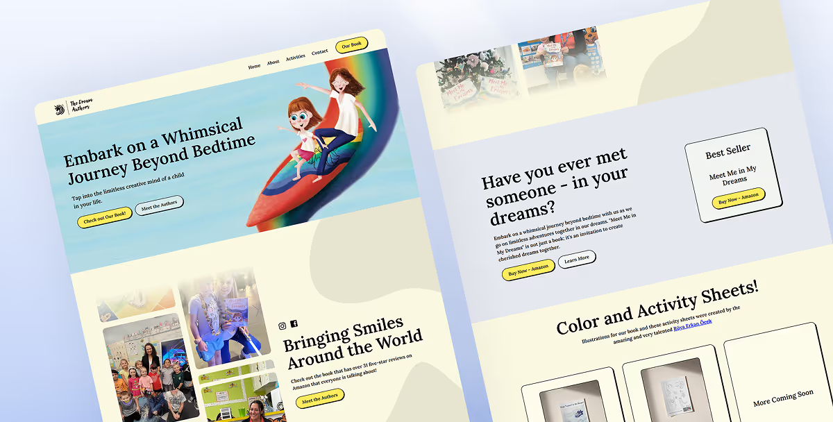
A Site That Sells the Books by Selling the Story Behind Them
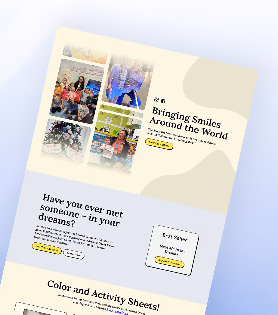
Children's book buyers, who are mostly parents, don't just buy a book. They buy into an author. They want to feel the personality behind the work before they commit, especially when it's something they're choosing for their kids.
The site was designed with that in mind. It leads with the books visually, introduces Kelly and the story behind the series, and gives visitors something to engage with through downloadable coloring pages and activities. Those activities aren't just a nice extra; they give people a reason to spend time on the site and come back. Kelly manages everything herself through the CMS.
Discovery & Strategy
Mapped what the site needed to accomplish, such as introducing Kelly's work, driving people toward her books, and giving visitors something worth engaging with, then structured everything around that.
Design & Development
Custom layout built with a CMS Kelly manages herself, allowing for new books, events, and activity downloads without any developer help.
Launch & Optimize
On-page SEO configured for discoverability, full walkthrough of the CMS with Kelly before handoff, and launched with a clean performance baseline.

"The web design team helped us every step along the way and his input on key features/functions for a website have been instrumental."

Every Feature Chosen For a Reason
Nothing on Kelly's site exists just to fill space. Each piece was built to introduce her books, pull people in, and make it easy to get a copy.
Book Showcase
Each book gets its own visual feature, including the cover, a description of the story, and a direct link to the Amazon listing. Parents can browse the series, understand what each book is about, and get to the purchase without hunting.
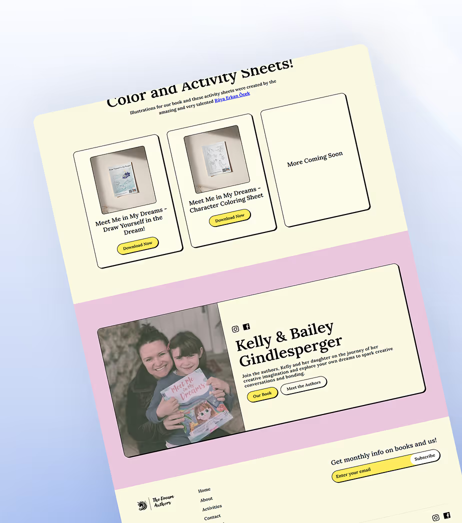
Coloring & Activity Downloads
The standout feature of the site. Downloadable coloring pages and activities tied to each book give kids something to do with the stories and give parents a reason to share the site and come back for more. Kelly adds new ones herself through the CMS whenever she has new material.
Author Story
A section that introduces Kelly and the story behind the books, explaining why she started writing them and what she hopes kids take away. It's what turns a curious visitor into someone who actually cares about the work before they buy.
Self-Managed CMS
Kelly updates the site herself with new books, new activity downloads, and new content without needing a developer. The CMS was built around how she actually works, not around what's technically easiest to set up.
Contact Form
A simple contact form for anyone who wants to reach Kelly directly, whether for press inquiries, bulk order questions, or readers who just want to say something kind.
Mobile-First Design
The site is designed to look and perform cleanly on any device because a parent discovering the books on their phone should have the same experience as one sitting at a laptop.
Ready to Build a Site That Works for Your Business?
Book a free 30-minute call. We'll look at what you have, understand your goals, and tell you honestly what would make the biggest difference.
Elicit Marketing builds websites designed around your audience so the right person lands on your site, understands what you do, and reaches out.